Using Light and Dark Colors to Make a Room Look Bigger

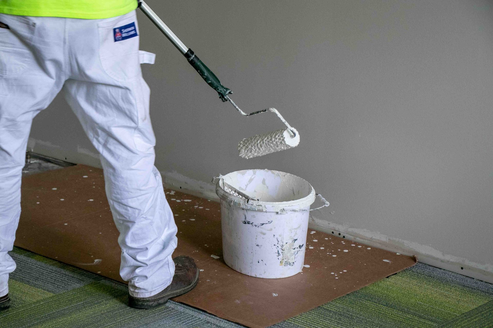
No matter how large your building or office space, it is by definition finite. As businesses grow or their missions evolve, it’s not uncommon even for larger spaces to feel as though they’ve been subdivided to oblivion. That can leave offices, waiting areas, and conference rooms feeling cramped. If you don’t have the option of moving to a larger space or knocking out a wall, might something as simple as paint colors be the answer to your problems? SmithPro Commercial Painting knows more than paint. We work with color theory to make your space more comfortable, more welcoming, and even seeming more spacious.
Color Choices
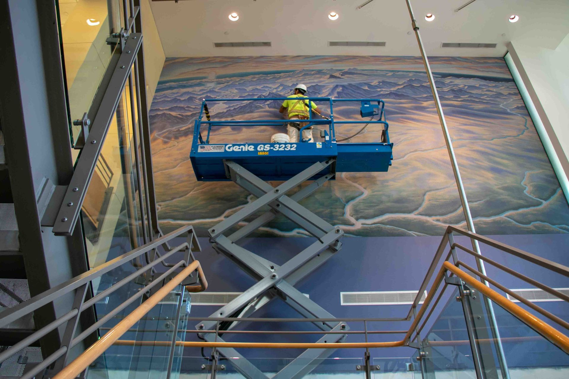
Using contrasting colors in commercial interior painting goes far beyond what simply looks good. Experienced commercial painting contractors know that it’s making the best use of all six walls. Yes, we said six. Your floors and ceilings also play a part here!
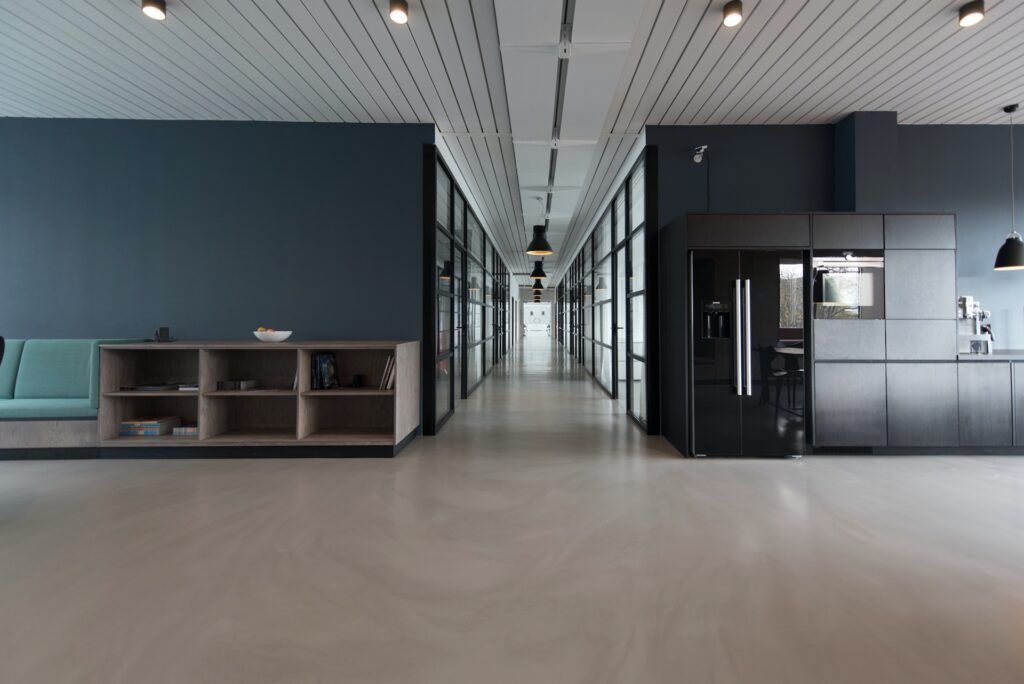
The conventional wisdom holds that if you want to make a space look bigger, you rely on light colors. There’s truth to that, since light colors make best use of light to draw the eye into and through a space. However, a room that’s all one color, or that’s simply based on different values of the same color, will start to look dull pretty quickly. Our eyes are drawn toward contrast, shadows, and texture. The use of a darker color, contrasting color, or even a custom wallcovering can help give presence and depth to a room.
So what does this look like in practice? Choose a light color to predominate, but if you have a feature toward which you want to draw the eye, use a darker contrasting color. This works well in rooms with ornate molding or fixtures, or a wall of windows (the brightness of the windows will offset the darker surrounds, and the color contrast makes both stand out more than either would on its own).
Naturally, the opposite is also true. Before your commercial painting project starts, think about elements you’d like to downplay in the room. Painting these the same color as the predominant color will help them blend in rather than being eyesores and contributing to a cluttered look.
Beyond the Paint
While we are commercial painting contractors, we’re also used to looking at the big picture. So we’d be remiss if we didn’t remind you of a few other things you can do to make a room look larger even after our work is done.
- Avoid busy-ness: Lots of furniture, or many colors and textures will make the space seem cluttered and cramped.
- Maximize your light: Whether it’s available light from a window or well-placed fixtures, good light can make even small spaces seem expansive.
- Take care with decor: Just like an accent wall can pull a room together, a statement piece — a single large painting or print, for example — often does more than a number of smaller pieces.
- Glass is your friend: Whether it’s an interior glass wall or window, or glass tops for desks and tables, glass keeps spaces looking open.
- Emphasize equilibrium: Whether it’s a combination of small and large elements, light and dark colors, or a smart layout, a visual sense of balance is always helpful.
SmithPro Commercial Painting has taken on a wide variety of residential and commercial painting during our long history. You learn a little something about making the most of small spaces over the decades, so why not let us help you with your painting challenges?