How to Choose a Paint Color That Will Draw the Eye

White walls can be dull, boring, and uninspiring. If you want to incorporate color in commercial spaces, SmithPro Commercial Painting can help you get it right — but you should also be aware that there’s an art and science to using paint colors to draw the eye. Done right, your commercial paint can help you in ways you may not have realized; done wrong, it can actually work against you. Here are some things to consider ahead of your call to us.
Don’t Choose Paint First
This may seem counterintuitive — especially coming from a St. Louis commercial painting contractor — but your paint color isn’t necessarily the first or most important choice you’ll make. Especially in commercial spaces, there are a number of design elements competing for attention; these can include everything from furnishings and fixtures to your logo and POP areas. It’s often best to plan those elements first so that you’re using paint colors to reinforce an area’s existing flow rather than competing with it since too many colors can compete for attention and keep the eye from being led to the right place.
Pay Attention to Intensity as Well as Color
Color psychology credits the right colors for everything from improving sales conversions to boosting productivity. However, as color psychologist Angela Wright points out in conversation with A Life of Productivity , color saturation matters at least as much as the choice of color. Intense, vibrant colors can be stimulating, but any stimulus can lose its effect or even become an irritant if it’s overdone. Varying intensities can tell a different story and can help you reap the benefits of certain color choices without fatiguing the eyes or the mind.
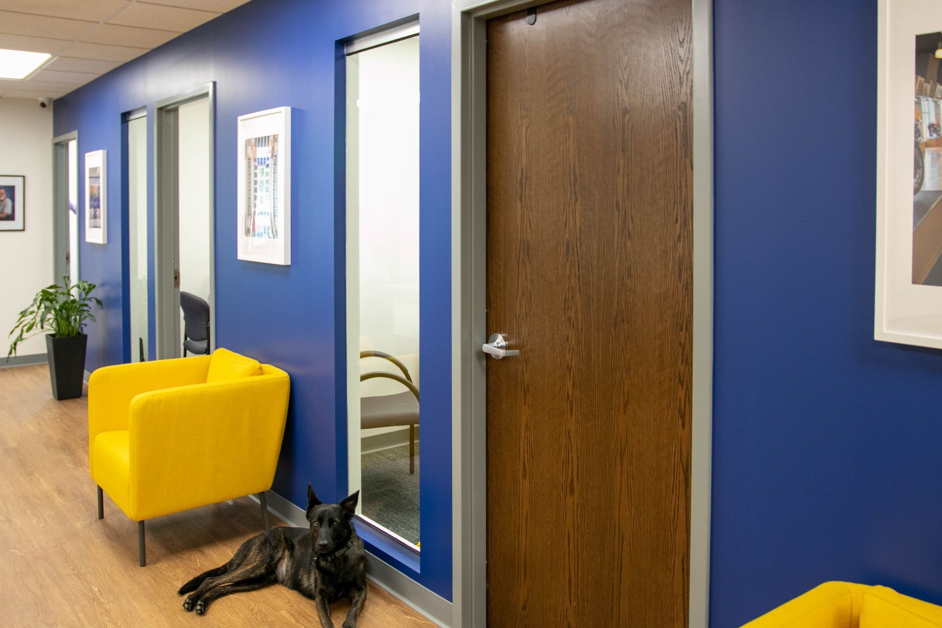
Use Contrasts
As we mentioned above, your interior and exterior paint colors are used in context. If you’re a gallery owner, for instance, muted colors are best because they let the artworks you’re displaying shine in their own right. If you’re in a historic building with ornate metalwork or unique architectural detailing, color contrasts can draw attention to what makes your space special. The color scheme in an office can highlight your professionalism or creativity, but you’ll want complementary or contrasting colors that emphasize you’re not a one-trick pony. If you’re painting a conference room or classroom, care needs to be taken not to have your color choices detracting from things that should be the focus of attention; sometimes you won’t necessarily want or need to draw the eye elsewhere!
Choosing Your Colors
As we pointed out in an earlier article discussing the benefits of repainting your business, color isn’t just about aesthetics. It’s also about the frame of mind it helps to create, and the ways in which it alters the perception of your space.
So there are a few considerations in play here. One is the use of your space; if it’s a corner office, your choices are likely to be different than they’d be for a lobby or other customer-facing area. Another consideration is the behavior you need that space to drive. Bright reds are good for areas that require physical productivity, for instance, but wouldn’t be good for an area that calls for calm. Yellow is a definite attention-getter, but it also places a degree of stress on the eyes if it’s too saturated. While greens are great for businesses that place a premium on interconnectedness and sustainability, its placid nature can be counterproductive in environments that require a fast pace, or where you need your employees to be on their toes.
The color wheel has more choices and gradations than we have room to discuss here, but we’ll take the time to walk you through your options so your color scheme is suited to your goals.
With so much to consider, we can understand if you’re feeling a bit lost right about now. You’re not alone — like your business, your commercial painting project is a team effort! SmithPro Commercial Painting will leverage our experience in custom color to make sure you’re getting attention for all the right reasons, and deliver work that’s done on time, on budget, and durable for the long haul. Contact us for a consultation today.