Our Blog

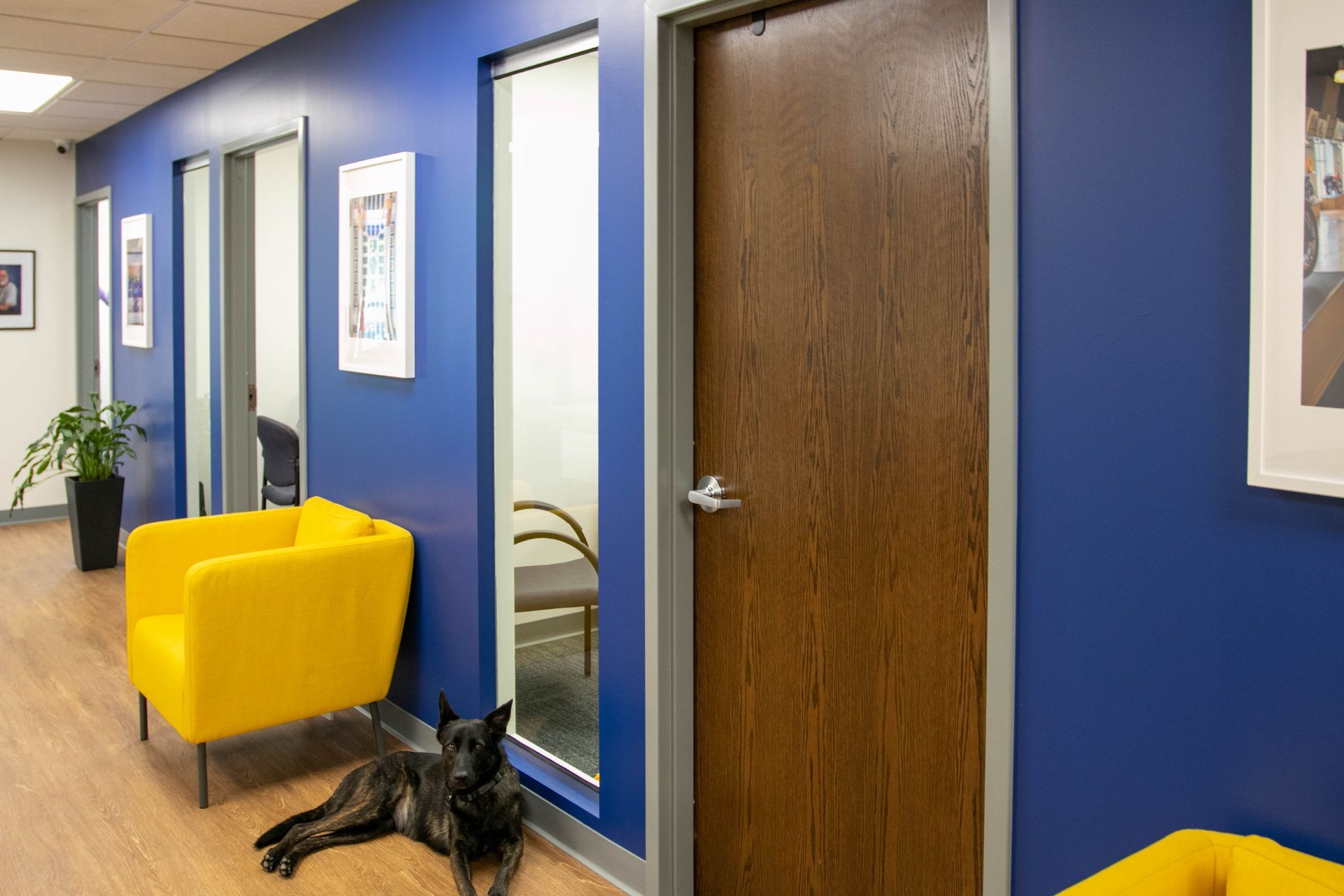
Discover how specialty finishes elevate commercial spaces with added durability, texture, and style, helping businesses create memorable, high‑performance interiors.
Understanding what drives cost can help you plan more effectively, avoid surprises, and make decisions that protect your facility long after the paint dries.
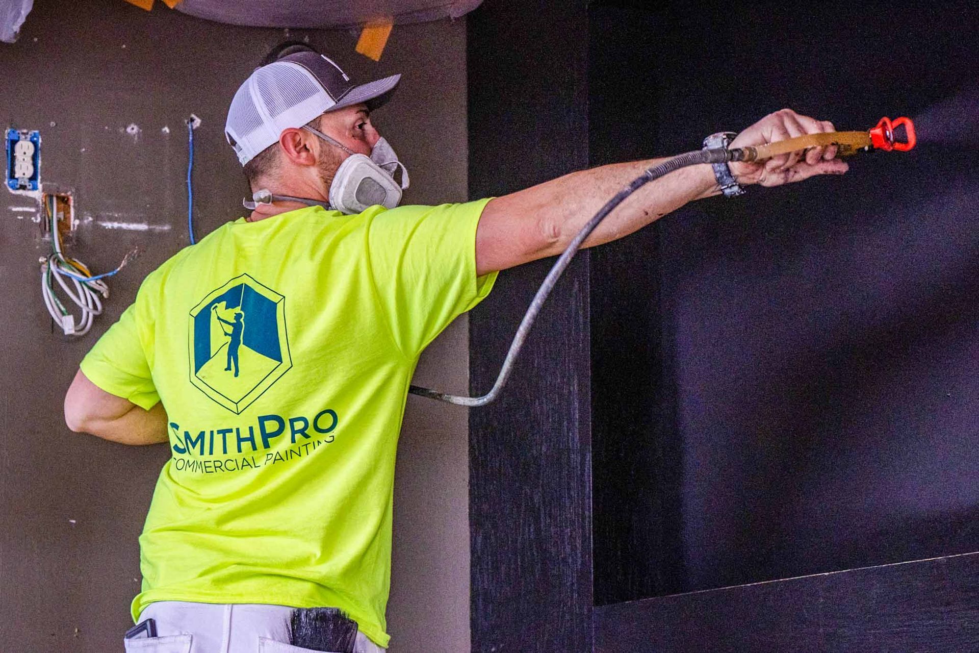
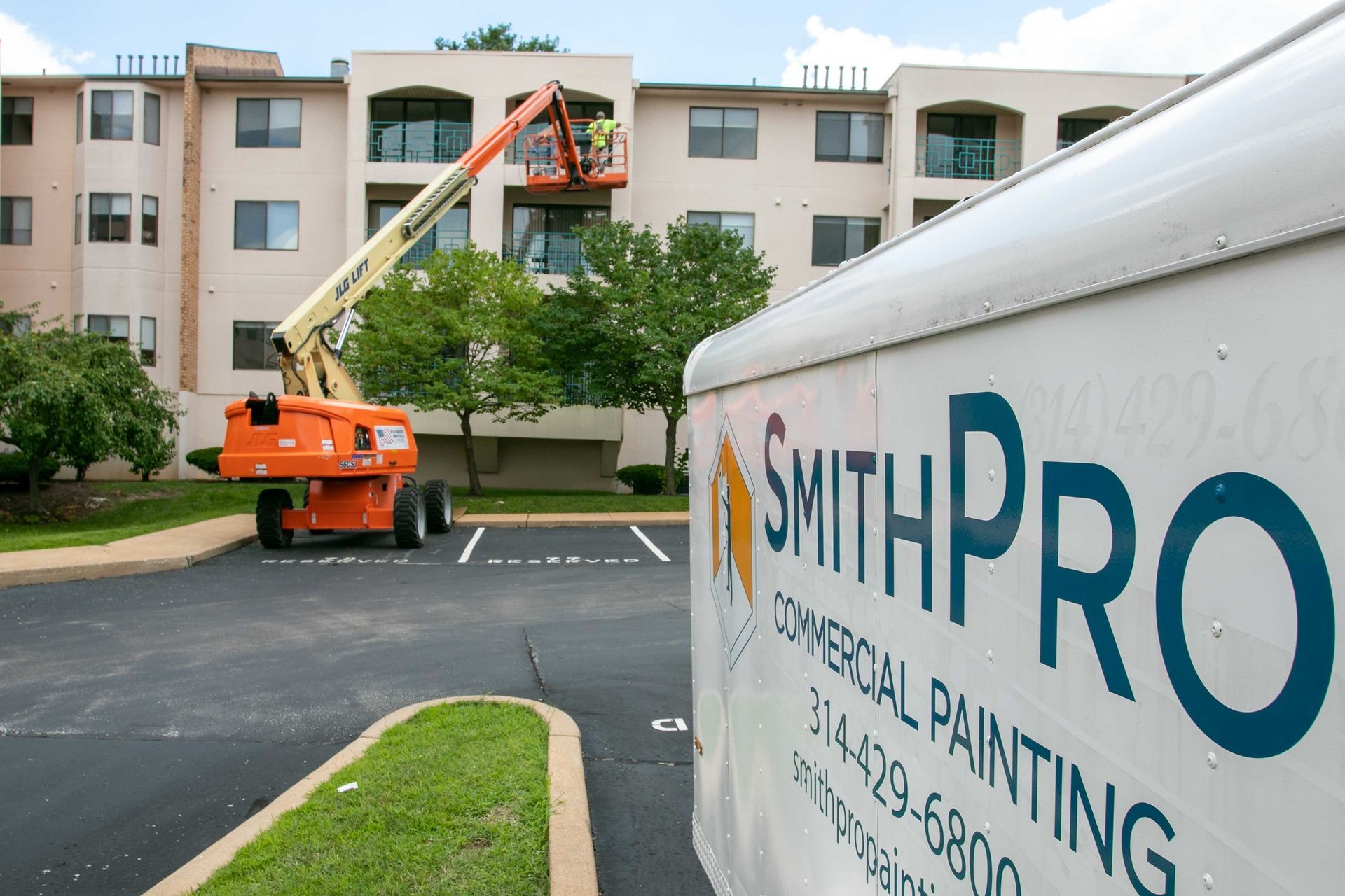
With the right commercial painting contractor, painting doesn't have to interrupt business. Learn what to expect when your occupied building is painted correctly.
A breakdown of typical repainting timelines by building type, along with the factors that determine how often your commercial property should be refreshed.

Color theory plays a crucial role in commercial painting, enabling businesses to use color intentionally rather than by guesswork.
Discover why commercial paint fails. Learn how to prevent peeling, chalking, checking, and blistering with expert tips from SmithPro Commercial Painting.